Designing Slack apps
Hello, fellow developer! We've compiled some best practices for you that dive into the finer details of designing apps.
From understanding your audience to successfully onboarding users, there's one underlying principle we recommend keeping in mind at all times:
Build with empathy for the end user. We all want to make our users' work lives more pleasant and productive. Your app is more likely to improve people's lives if you take into account the different ways that people work.
While some social groups use Slack to communicate, most people come to Slack to get work done. How they work may be a bit different. So how will your app help all these people get work done?
Designing with intention
Slack users are people of all ages, races, genders, and ability levels. They may have poor internet connections or only use Slack on mobile. We want them all to have a great experience on Slack, so please be empathetic of your audience while designing your app. Here are a few factors to keep in mind:
-
Timezones. Slack is used by people across the world and across timezones. If you're planning to post notifications at a particular time of day, understand that it will be a different time for some people in the workspace.
-
Languages. Slack is used collaborately by people of differing languages and regions. Tailor your app's language to create a localized experience for specific users and channels
-
Workspace size. Not all Slack workspaces are the same size. There are five-person non-profits using Slack, and there are 50,000 person companies using Slack. Some workspaces keep their conversations in a dozen channels, while others create channels for every new project.
To make your app work well for 5 person workspaces and 50,000 person workspaces, take into account how your app uses lists of users and channels. You may need to leave room in your UI for extra channels, or find ways to abbreviate or truncate what you display.
-
User roles and access. There are several different user types in Slack. Aside from regular users, you should be aware of guest accounts, which are restricted to fewer channels. You may also come across actions performed by other bot users — depending on your app's purpose, it may be appropriate to treat them as regular users.
Some users have permissions that others do not. For example, administrators can only permit certain people to install and manage apps, so prompting a guest user to authenticate their account may lead to a dead end. If you can, test your app using a variety of user types.
-
Slack desktop vs. Slack mobile. Some people only use Slack on their phones, while others only use it in a web browser. Make sure that you test our your app's interactivity and messages on as many screens as you can.
-
Workspace preferences. Some Slack workspaces may prevent users from editing or deleting messages. Some Slack workspaces may have a 1-hour message retention, meaning older messages are automatically deleted. Take a look through our Help Center for some example of workspace-level settings.
-
User preferences. Each individual user may have different settings. For example, they may choose to display username rather than full names, or they may automatically collapse all images and media within a message. Try to familiarize yourself with as many of Slack's user preferences as you can.
-
Familiarity with apps. Just because somebody installs your app on their Slack workspace, it doesn't mean that everybody else on the workspace knows about it. Some people may not even know that Slack apps exist, and may think that your app is part of Slack's built-in functionality.
Gather feedback
Gather feedback and surveys from a diverse range of people within your organization. We don't prescribe what feedback or ideas to seek, but here are some thought experiments to try:
- Are there any regular types of message that are posted manually? Imagine a manager posting in a channel every Friday afternoon asking for status reports. This could be turned into an app or workflow that posts reminders on the same schedule. The app could also collect the responses in a better format for the manager to consume later.
- Ask team members to find one or two automated messages that they’ve received in the past week or so that are critical to their job. These automated emails can often be turned into messages posted by Slack apps.
- Think about the key hurdles that people face when using Slack in your team, and outline them. Can an app or workflow automation solve those problems?
- Do you regularly use an external service while working? If the service doesn't already have its own integration in the Slack Marketplace, build an app that integrates that service into Slack using that service's web-based API.
If you need some inspiration, explore the Slack Marketplace!
Case study: Slackbot
We've developed our own set of guidelines for using Slackbot in an empathetic way:
Your app has its own special purpose and personality.
Map out your bot's logic and conscience while working through these best practices to help develop consistent and user-friendly experiences that feel at home on Slack.
Considering bot design
Bot names
Pick a name that is representative or your brand and what the bot does, being careful not to violate trademarks and other brand names.
Your bot's username must follow our regular username guidelines: lowercase letters, numbers, underscores, dashes, periods, and less than 22 characters in length.
Some Slack users prefer to see full names rather than usernames. In this case, the bot's "full name" will inherit the name of your app.
To update the name of a bot that has already been installed, navigate to your workspace settings by clicking on your workspace name in Slack, then Tools & settings, then Manage apps. Once you've navigated to the app management dashboard, you can find Bot user and rename it.
Slash commands
Should you choose to create a Slack app (as opposed to a workflow automation) choose a descriptive name for your slash command, but make it easy to remember and type.
If your application provides printing services, then /print makes sense, but avoid using copyrighted names that you do not own like /HP or /canon (unless you work there, in which case it's a great idea).
If your service is known by its name, a command with your company's name in it (like /lyft and /uber to request car sharing service) is an easy way for Slack users to remember how to invoke your slash commands.
When a slash command with the same name is created by another app, it will override pre-existing slash commands with that same name. Try to choose a name that won't override or be overridden by another developer's carefully named command.
Pick a name that is easy to remember and connects directly with a purpose. Users shouldn't have to explore the slash command drop down every time they go to do that thing.
Colors
There are a couple of different places where you can customize colors used in your app.
Message attachment bar
The first is the set of colorful bars guarding the edge of messages.
Utilize your brand color to complement your app's avatar to more clearly brand your messages.
Your service may already associate specific colors with workflow transition types and objects — prioritize clarity and legibility by using the colors that will most clearly resonate with our common users (e.g. green for confirmation, red for cancelling actions, colors that are legible and not overbright).


When you're not harmonizing with your brand, we suggest using the default light gray. If you're looking for just a little more distinction, consider using optional color values good, warning, or danger.
App Profile background color
The second place where you can choose a custom color is in your app's profile background. If somebody clicks on your app's name, a little profile card with a brief description of your app will be displayed.
The top section containing your app's name and icon will be displayed with your custom background color. It should pair nicely with the colors in your icon, and there should be enough contrast that you can read the white text on top.
Logo assets
- Pick a compelling logo that will look great, adaptively rendering at 512x512px on desktop, and 36x36px on mobile. Illustrations work better than photos.
- Don't include lots of text that will be hard to read at a small size
- Don't round the corners — Slack will do it for you!

Messaging with consideration
Messages that alert users can be incredibly useful. Many Slack apps exist primarily to pipe notifications from external services into relevant channels. Here are some specific considerations that can help ensure the messages your users want don’t turn into noise.
Be upfront about communication
When your app is first installed, allow the installer to easily set preferences that relate to communication. Think about settings like the rate of messages, the channel they should be posted to, and if applicable, the type(s) of notifications your app should send.
Avoid large-group mentions
There are very few cases where your app should send broad mentions like @channel, @here, or @everyone. One exception might be if your app sends a notification for immediate action when a critical system or service goes down. Even then, you should get explicit permission from the installer before your app uses one of these mentions.
Pick the right frequency of notifications
Consider how frequently your messages are generating notifications for a user. When it makes sense, offer the user an option to get a digest of these messages rather than being alerted for individual events. This is especially important when the events are coming from an automatic source like service logs. In extreme cases, sending too many messages can get your token revoked due to rate limits.
When your app generates a lot of notifications, users will notice (and might grow annoyed). This can lead them to remove your app from a channel or even to uninstall the app from the entire workspace. One way to mitigate this is by surfacing messaging preferences often. Make it intuitive for people to use your app how and when they want.
Here's an example of an app that builds a preferences link into the actual messages:

Match message types and channels
You may already be segmenting or categorizing the types of messages that users can receive. If your service already does this, you can make the Slack notification experience even better by giving people the option to pipe different message types into different channels.
For example, an HR tool might want to pipe messages about a candidate’s background check only into #hr-team, but after an offer has been accepted and signed, maybe a #new-hires channel wants to be notified so they can celebrate.
Don’t post to a workspace’s #general channel by default. You’ll likely be unnecessarily disrupting many users and there is probably a more relevant channel for your app to post in.
Make messages that notify actionable
Some messages are best being only text that alerts a channel that something happened in a third-party system. But oftentimes messages lead to follow-up action.

You can save people work by adding action elements directly into your app’s Slack messages. Buttons, select menus, and modals let people react in the moment and get work done faster. If your app is considerate with alerts and saves people time, they’ll likely find your app an essential part of their workday.
Your actionable messages don’t need to be complex to be helpful. Just think about what action the receiver most likely wants to take. For example, if your app sends expense approval messages, the receiver probably wants to approve or deny the expense — interactive buttons are perfect for this.
Learn more about sending messages in our messaging docs.
Sending direct messages to users
First, consider when and whether you should send direct messages (DMs) to specific users. Remember that DMs generate push notifications for mobile users and badges on desktop and mobile. These are useful but also disruptive and can be unexpected, so be cautious with your use of DMs. You should only DM a user when:
- The user sends you a DM first.
- The user is the only one you’re providing a service to, rather than the team.
- Your app is sharing confidential interactions or information.
Users will assume that information shared back and forth with your app in DM is private. Be aware of any sensitive information that’s being shared, and don’t surprise users by announcing results of DM conversations in channel without letting them know first.
By default, apps are set up with a messaging tab that allows the app to broadcast messages only, without needing to anticipate or respond to human interaction.
Responding to users in channel
Whatever you post in channel is going to be long-lived and add to the group conversation that people are reading, both in the moment and later when they look back at what was shared.
In response to a user action, an app could publish an in-channel message, or an ephemeral message. In-channel response will be visible to all channel members where the user invoked the action. Ephemeral responses will only be visible to the invoking user.
Remember that a chatty app is not necessarily a good thing, so only pick responses that are important to the entire team when posting in-channel.
If the response only needs to be displayed to the user, it’s a better idea to use an ephemeral message than it is to generate a DM.

Read more about ephemeral messages in our Messages docs.
Communicating with clarity
Your app will converse with users frequently, whether via conversational interface or structured interactions. It's vital that the voice and tone of your app's articulation is brief, clear, and human.
Your Slack app is a representation of your brand, and the way your app communicates will become part of your brand voice, especially if you’re building a conversational interface.
This presents a great opportunity: you can thoughtfully define what your brand voice is. The best thing to do is think of this voice as an extension of your own voice.
Providing personality
Your app’s primary purpose is to help users accomplish a task—even if that task is inherently entertaining, like finding just the right cat GIF. It's great if your app sounds clever, just ensure these traits don't obstruct the user's ability to complete the work your app is assisting them with.
Foreground the information necessary to the task at hand, then add voice and tone elements. They should enhance what’s already there.
You want your voice to differentiate yourself from the crowd. Using contractions and conversational cadence is a good way to lightly infuse your app with human personality—“You’ll be able to” rather than “You will” and that sort of thing.
A little goes a long way.
Be brief
Nearly every word your app says should facilitate an interaction (courteous parts of speech, such as greetings, are also useful). Don’t add a joke or aside just to be glib.
Like this

Not like this

The first example still has plenty of distinctive personality, but gets straight to the point, and doesn’t risk users choosing not to wade through unimportant content.
Be clear
Words and copy used in your interactions should be easily understood even by someone who doesn’t speak the same language fluently. That means:
- Don’t use jargon and slang in the important parts of message text
- Avoid culturally specific references, like jokes from movies
- Stick to common, understandable words
- Button labels should be clear and specific
- Make buttons active-voice and reflect the user’s outcome (Save, Book Flight, Place Order)
- Avoid vague, non-actionable text like Click here or Settings
- Don’t replace words with emoji
If you choose to include puns or wordplay, make sure they focus a user's attention, rather than creating a distraction.
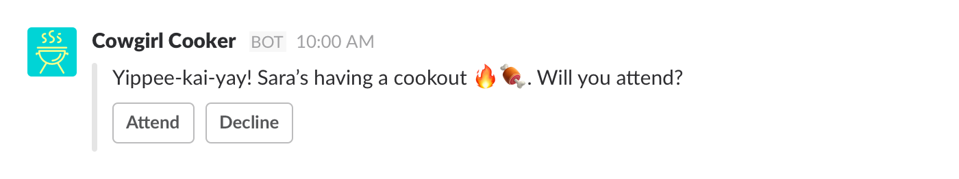
Like this
Not like this
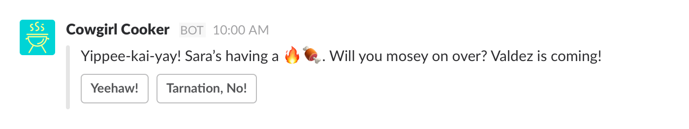
The second example is confusing in two ways: it includes a reference to an obscure film, and the emojis it uses may stall some users as they try to decipher their meanings (“Fire... meat? Firemeat?”).
The message button copy is also unclear and confusing, potentially preventing users from selecting any response at all. We recommend using standard combinations on buttons (Attend/Decline, Confirm/Cancel) to help your users have a smooth experience with your app.
Be empathetic
All kinds of people use Slack, and we previously described how important it is to understand that variation in terms of their ability to use your app properly. But that diversity is also important when thinking about the tone you use to communicate with them.
Ensure that your voice and tone express empathy toward every single person who uses your app. Some basic steps to take include:
- Use gender-neutral pronouns.
- Use a variety of emoji skin tones.
- Don’t use sexist, racist, or ableist language.
- Make an effort to trial your voice and tone with people from a diversity of backgrounds, in different settings (on mobile, with flaky wifi, etc.).
- Don’t assume any level of technical fluency from your users - keep instructions clear.
- Writing for a broad audience takes a bit of practice if you’re new to it, and it is usually easier if you have a diverse team of people working on your app from the start.
- If you decide to give gender to your app (and it’s very easy not to), then be appropriate with the kind of things it says - make sure it doesn't use any stereotypes or generalizations.
A final note: informality is good, but getting too friendly is often seen as grating or culturally insensitive (particularly in a workplace).
Localiz(s)ing your Slack apps
Slack app localization allows an app to provide specific text written for specific locales by using API methods to automatically detect the locale of users and conversations.
Use localization to customize your app's experience. This can include:
- Changing languages to suit different audiences.
- Customizing cultural references for a specific region, culture, or language.
- Tailoring interactivity. For example, a travel booking app can select a default departure airpot for a user based on their locale.
You can localize any text that your app publishes directly to users, such as in messages and modals.
You cannot localize pre-configured text in slash commands or message actions. Nor can you localize your app's display name.
Knowing which language to display
There are two basic preferences for language that are visible to apps:
- The chosen language of the conversation that the app is currently operating in.
- The display language of an individual user of the app.
A localized app should use the channel's locale for channel-published content. The app can then optionally use an individual user's locale for content only visible to that specific user.
The goal should be to ensure that the most common language is chosen for the entire audience in each context.
Imagine a French-speaking user is in a German-speaking public channel. Your app can use French in private interactions with the French user, while using German in the German-speaking public channel.
Retrieving locale preferences
There are multiple locations you may encounter the locale field, indicating a preferred language.
- Retrieve the
localeof a conversation by using theconversations.infoWeb API method and setting theinclude_localetotrue. - Retrieve the
localeof a user by using theusers.infoWeb API method and setting theinclude_localeparameter totrue. - Receive a
localefield within any Events APIuser_changeevent object.
Your app should check the conversation or user locale every time the app wants to publish or update content.
.%20Try%20it%20out%20by%20using%20the%20%60/task%60%20command%20in%20this%20channel.%22%7D%7D,%7B%22type%22:%22section%22,%22text%22:%7B%22type%22:%22mrkdwn%22,%22text%22:%22*2%EF%B8%8F%E2%83%A3%20Use%20the%20_Create%20a%20Task_%20action.*%20If%20you%20want%20to%20create%20a%20task%20from%20a%20message,%20select%20%60Create%20a%20Task%60%20in%20a%20message's%20context%20menu.%20Try%20it%20out%20by%20selecting%20the%20_Create%20a%20Task_%20action%20for%20this%20message%20(shown%20below).%22%7D%7D,%7B%22type%22:%22image%22,%22title%22:%7B%22type%22:%22plain_text%22,%22text%22:%22image1%22,%22emoji%22:true%7D,%22image_url%22:%22https://api.slack.com/img/blocks/bkb_template_images/onboardingComplex.jpg%22,%22alt_text%22:%22image1%22%7D,%7B%22type%22:%22section%22,%22text%22:%7B%22type%22:%22mrkdwn%22,%22text%22:%22%E2%9E%95%20To%20start%20tracking%20your%20team's%20tasks,%20*add%20me%20to%20a%20channel*%20and%20I'll%20introduce%20myself.%20I'm%20usually%20added%20to%20a%20team%20or%20project%20channel.%20Type%20%60/invite%20@TaskBot%60%20from%20the%20channel%20or%20pick%20a%20channel%20on%20the%20right.%22%7D,%22accessory%22:%7B%22type%22:%22conversations_select%22,%22placeholder%22:%7B%22type%22:%22plain_text%22,%22text%22:%22Select%20a%20channel...%22,%22emoji%22:true%7D%7D%7D,%7B%22type%22:%22divider%22%7D,%7B%22type%22:%22context%22,%22elements%22:%5B%7B%22type%22:%22mrkdwn%22,%22text%22:%22%F0%9F%91%80%20View%20all%20tasks%20with%20%60/task%20list%60%5Cn%E2%9D%93Get%20help%20at%20any%20time%20with%20%60/task%20help%60%20or%20type%20*help*%20in%20a%20DM%20with%20me%22%7D%5D%7D%5D%7D)